Roller Coaster Visualizations
Introduction
A few weeks ago I found myself at Cedar Point, the foremost American roller coaster park. Rather than just having fun like a reasonable human being, I decided to spend some time gathering data on a few rides. Specifically, I wanted to get a sense of the g-forces felt by a rider on a variety of coasters. I collected some cool data, but I'm also interested in presenting it in some way which is more interesting than a series of line graphs. Specifically, I've been trying to create a visualization for roller coaster accelerations which is visually interesting, aesthetically pleasing, and of no practical use whatsoever (lest this become too much like actual research...). If you'd like to see my results, you can skip to the gallery at the end. Otherwise, read on!
Experimental Setup
I ran all of the experiments presented here using my LG Nexus 4 phone, using the free Physics Toolbox Accelerometer app. This app just measures the x, y, and z accelerations detected by the phone's accelerometer and records them to a CSV file. My phone's accelerometer also saturates at approximately 4g, so I have no measurements above that value. I kept the phone in my pocket during the rides, which kept it tightly attached to my body, so the accelerations it measured should be representative of what my entire body was undergoing.
Presentation
This entire post is actually an IPython notebook, which is a fabulous piece of software for creating interactive scientific documents. You can also view it through the IPython notebook viewer: graphs.ipynb. All of the code referenced here is from the coasters repository on GitHub.
%pylab inline
%load_ext autoreload
%autoreload 2
import os
from mpl_toolkits.mplot3d.axes3d import Axes3D
from pycoasters.images import show
from pycoasters.coaster import Coaster
Loading the data
We start by pulling in the raw sensor data, along with some annotations. I'll be starting with the data from Gatekeeper, the newest roller coaster at Cedar Point as of my visit in Fall 2013. All the accelerations are reported in g (where $1\,\text{g} = 9.81\,\frac{\text{m}}{\text{s}^2}$ and is gravitational acceleration felt at the Earth's surface).
ride_name = 'gatekeeper'
data_folder = 'data/2013-09-28-cedar-point'
ride_folder = os.path.join(data_folder, ride_name)
gatekeeper = Coaster.load(ride_folder)
Plotting the raw data
First, let's just plot the raw x,y,z data from the sensor
f = figure(figsize=(8,6))
ax = subplot(111)
gatekeeper.plot_original_xyz(ax)

This is promising! We can clearly see the general outline of the roller coaster's motion, with a big hill at the beginning and then about 10 major accelerations as the coaster goes around the track.
Fixing the orientation
Unfortunately, this isn't a very interesting display yet. For one thing, the orientation of the data is based on the orientation of the phone while it was sitting in my pocket during the ride, which probably changed every time I sat down in a new coaster. I'd like to transform the data into a common reference frame, with $\hat{z}$ straight up, $\hat{x}$ forward (along the direction in which the car travels), and $\hat{y}$ 90 degrees left of the direction of travel, so that we can compare the direction of acceleration across different rides. Fortunately, we know a few things about roller coasters that we can use to figure out how to make this transformation.
First, we know that every coaster starts and ends at rest, with the only acceleration being that due to gravity, which is always vertical. Thus, we just need to find a section of time corresponding to a period of rest at the beginning or end of the ride, then rotate all of the acceleration vectors so that the value at that time period is along the z axis. I've annotated the region of resting data I chose for this coaster with a light blue rectangle in the graph above.
This rotation alone isn't enough to fully correct the orientation of the acclererations, since it only tells us which way is up, not which way is forward or backward relative to the car's travel. If that isn't obvious, just imagine being inside a sealed room sitting somewhere on Earth (physics majors love sealed boxes in uniform gravitational fields...). From the direction of gravity, you'd be able to tell which way was up or down, but you'd have no information about which was was, say, North or East without some other piece of data. However, if your room were suddenly tilted toward the North Pole, you would be able to observe the change in direction of gravity, and the direction of gravity before and after the tilt would be enough to figure out exactly which way was North.
Fortunately, roller coasters almost all do something very much like this. The first thing a coaster does after leaving the station is to go up a large hill to build up some potential energy. The side effect of this is that the direction of the acceleration felt by the occupants (and the phone recording data) shifts exactly forward relative to the direction of travel for the car. This gives us enough information to perform a second rotation and transform the acceleration data into the reference frame we wanted. I've highlighted the time during which this coaster tilts back to go up the hill in red.
The code to perform these rotations is found in Coaster.reorient() in coaster.py. The regions of rest and tilting back are annotated by hand in the notes.json file accompanying each raw data set.
Plotting the reoriented data
Here's the results after reorienting the data from this ride:
f = figure(figsize=(8,6))
ax = subplot(111)
gatekeeper.plot_reoriented_xyz(ax)

Note that at the beginning and end of the ride (blue highlight), the acceleration in x and y is (roughly) 0, and the accleration along z is roughly 1g, corresponding to the vertical acceleration of gravity. You can also see that when the car tilts back to go up the hill (red highlight), the z acceleration decreases and the x acceleration increases, while the y acceleration stays mostly constant (there's some change in y due perhaps to me shifting in my seat). In addition, since the z and x acclerations are approximately equal during the red period, we can conclude that this ride must have an ascent angle of about 45 degrees. In fact, the Cedar Point website gives the lift angle for Gatekeeper as 40 degrees, quite close to our estimate.
Some more examples
Here are the reoriented graphs for a few more roller coasters, for comparison. The Cedar Creek Mine Ride is an older steel roller coaster with some very jerky accelerations: Mine Ride POV video, and the Witches' Wheel is a ride consisting of a ring of cars attached to a wheel which spins rapidly and then slowly tilts from horizontal to vertical and then back to horizontal: Witches' Wheel POV video
# Cedar Creek Mine Ride: an older steel roller coaster with some very jerky accelerations
mine_ride = Coaster.load(os.path.join(data_folder, 'cedar_creek_mine_ride'))

# Witches' Wheel: a ride consisting of a ring of cars attached to a wheel which
# spins rapidly and then slowly tilts from horizontal to vertical and then back to horizontal
witches_wheel = Coaster.load(os.path.join(data_folder, 'witches_wheel'))

f, ax = subplots(2, 1, figsize=(8,12))
mine_ride.plot_reoriented_xyz(ax[0])
witches_wheel.plot_reoriented_xyz(ax[1])

Finding a more interesting display
Graphs are great for displaying quantitative relationships among data, but the purpose of this project was to come up with a visually interesting representation of the character of each roller coaster's motion, rather than just an accurate graph. To my eye, these graphs are pretty dull, and it's hard at a glance to really understand what riding a coaster feels like. I ended up spending a long time playing with alternative representations of these acceleration data.
3D plots
One possible representation that I experimented with was a 3D plot of the x,y,z and time data. Since I actually have four dimensions of data (including time), a 3D representation has to involve some condensing of the data. I decided to try ignoring the y acceleration, which corresponds to lateral motion of the car and is typically smaller, and plotting (x, time, z) as my 3D data. Here's what this looks like for the Witches' Wheel data:
f = figure(figsize=(10,7))
ax = subplot(111, projection='3d')
witches_wheel.plot_xtz_3d(ax)

This ride shows a beautiful pattern in the 3D data as the acceleration rises smoothly from 1g to 2g as the wheel begins to spin, then begins to oscillate through x and z as the wheel rises to vertical and the centrifugal acceleration felt by the riders aligns with, then against, gravity. Unfortuantely, the data from most of the other rides, like Gatekeeper, is too messy to show much:
f = figure(figsize=(10,7))
ax = subplot(111, projection='3d')
gatekeeper.plot_xtz_3d(ax)

Using color
Ordinarily, color is a poor choice for quantitative data. People have trouble assigning unambiguous orders to colors (Is green in between red and blue? Or is red in between blue and red?), and we also have trouble making quantitative comparisons (What color is half as red as red? 80% more blue than blue?). Fortunately, I'm not interested in recovering any real quantitative data from my displays, so this isn't a problem. I decided to use a 3D color space to represent the 3D acceleration vector at each point in time. To do this, I used the x acceleration to map to a red value between 0 and 255, the z acceleration to map green between 0 and 255, and the y acceleration to map blue between 0 and 255. I chose the (x,z,y) -> (r,g,b) mapping purely based on my judgement of how attractive the output was. I also shifted and scaled the color values to try to use most of the available color space given the range of accelerations in my data.
My first experiment with color involved creating a square image, in which each pixel represents a single time point, arranged so that time increments left-to-right and top-to-bottom. Here are the results for a few coasters:
# Gatekeeper
show(gatekeeper.portrait_square())

# Witches Wheel
show(witches_wheel.portrait_square())

# Cedar Creek Mine Ride
show(mine_ride.portrait_square())

These images certainly have some promise. We can see the repetitive, smooth acceleration changes of the Witches Wheel, and we can see the jerkiness of the Mine Ride in its sharp, rapid changes of color. However, the grid arrangement makes it difficult to see exactly how the values change over time (since reading left-to-right row-by-row in an image is awkward). To try to account for this, I experimented with compressing the same data into a single row of data, in which each vertical column of pixels corresponds to one time point. Here are those results:
# Gatekeeper
show(gatekeeper.portrait_line())

# Witches Wheel
show(witches_wheel.portrait_line())

# Cedar Creek Mine Ride
show(mine_ride.portrait_line())

This is an improvement, as the time variation of acceleration in each ride is more obvious, but it's difficult to get a sense for the magnitude of the accelerations from these images.
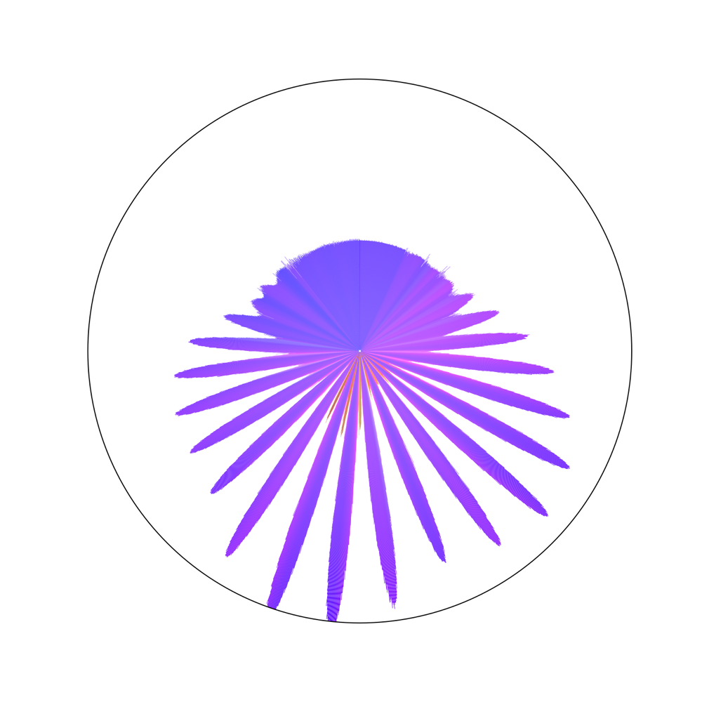
The answer: polar plots
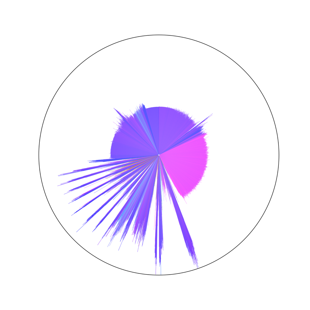
My final visualization method addressed most of the issues that I had encountered previously. I used the same acceleration-to-color transform as in the previous images, but normalized the acceleration magnitudes before transforming to color, so that the color indicates only the direction of acceleration. I then arranged the colors as a polar bar chart, with time increasing clockwise from 0 at the 12-o'clock position, and with the length of each bar corresponding to the log of the acceleration magnitude. I chose log(magnitude) in order to reduce how far the very large accelerations extended from the center of the figure. Here are the results:
# Gatekeeper
figure(figsize=(10,10))
gatekeeper.plot_portrait_polar(subplot(111,polar=True))

# Witches Wheel
figure(figsize=(10,10))
witches_wheel.plot_portrait_polar(subplot(111,polar=True))

# Cedar Creek Mine Ride
figure(figsize=(10,10))
mine_ride.plot_portrait_polar(subplot(111,polar=True))

I'm extremely happy with these polar acceleration portraits. The use of time as the angular coordinate is very natural, since it fits nicely with the way in which the end of every ride always comes back to exactly the same place as the start. These graphs also emphasize a lot of features that I think are fundamental to the experience of each individual ride. For example, it's easy to see that the Witches' Wheel has an extremely repetitive pattern of accelerations which grow in intensity and then diminish, while the Mine Ride just has a lot of very sharp jerks and changes in direction. We can clearly see the sharp change in direction when Gateekeeper begins to climb its hill as a shift from blue to pink near the 2-o'clock position, and we can see that the Mine Ride has two such hill climbs, at 1-o'clock and again at 8-o'clock.
We've now created a visually interesting presentation of each roller coaster, which gives at least some idea of what that coaster might feel like to ride, and which is at the same time utterly useless. Success!
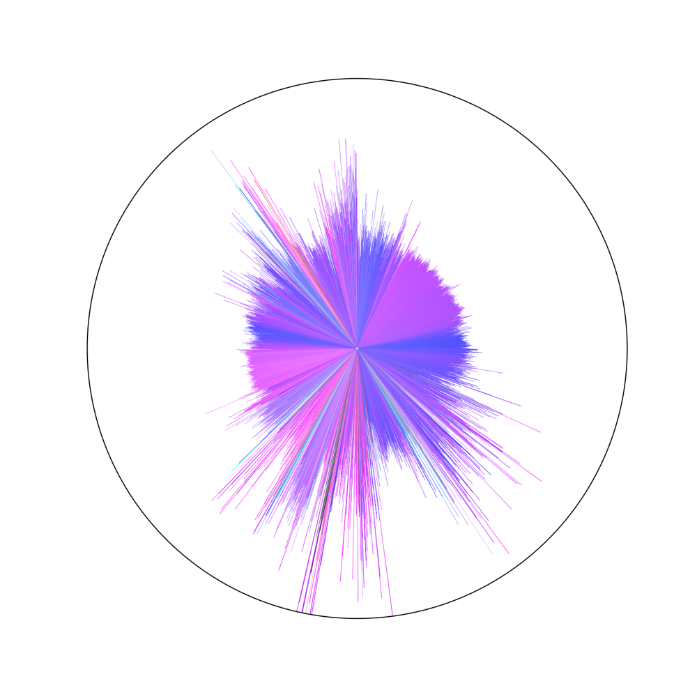
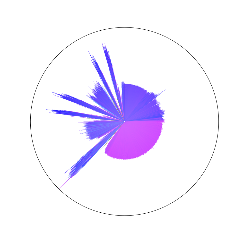
Gallery
Here is a gallery of all of the roller coasters for which I have reliable data from my trip to Cedar Point, presented as polar acceleration portraits. Each line in the image represents a single time point, and time increments clockwise from the 12-o'clock position. The length of each bar indicates the magnitude of acceleration, and the color indicates the direction, as described above. Click on any plot to download a (very large) vectorized PDF version of that plot.
Cedar Creek Mine Ride
An older steel roller coaster. Sharp accelerations and quick changes of direction characterize this ride. It also has a second, smaller lift hill about 2/3 of the way through the ride.
Gatekeeper
A brand-new steel roller coaster, with extermely smooth turns and strong accelerations.
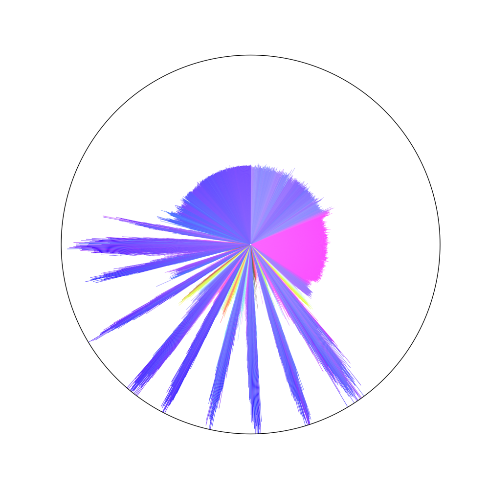
Witches' Wheel
A spinning wheel with cars attached to the perimeter. The wheel stays horizontal while it gains rotational speed, then tilts up to nearly vertical while still spinning and then returns to horizontal and slows down.

Gemini
Another older steel coaster with a wooden frame, Gemini has a very long lift hill and relatively few hard accelerations.
Magnum XL200
The Magnum was the tallest and fastest roller coaster in the world when it was built in 1989. It's particularly notable for its rapid up-and-down accelerations near the end of the ride.
Max Air
Max Air consists of a wheel with seats mounted on its circumference, attached to a giant pendulum. The wheel spins as the pendulum swings, creating a different direction of acceleration with each swing.
Conclusion
Well, that was certainly useless. Excellent. I'll look forward to recording more rides next time I have the chance.